Posts By :

Paul Cunningham

construction company engineer website designers ireland

Web Design for Irish Construction Firms | What Really Works

Web Design for Irish Construction Firms | What Really Works 1536 1024 Paul Cunningham

The construction industry in Ireland is thriving, with demand for residential builds, heritage renovations, and commercial projects all on the rise. But with competition strong, a company’s website often becomes the deciding factor in whether an enquiry turns into a contract.

So what really works when it comes to web design for engineering and construction firms? The answer lies in building trust, filtering enquiries effectively, and presenting work in ways that resonate with potential clients.


Smarter enquiry forms

Preparing proposals takes time, resources, and expertise. To avoid investing effort in projects that aren’t a good fit, enquiry forms can help screen leads early. By asking questions about project type, location, budget, and timeline, firms can quickly judge whether a lead is worth pursuing.

This saves valuable hours while giving potential clients confidence that they’re dealing with a professional, structured business.
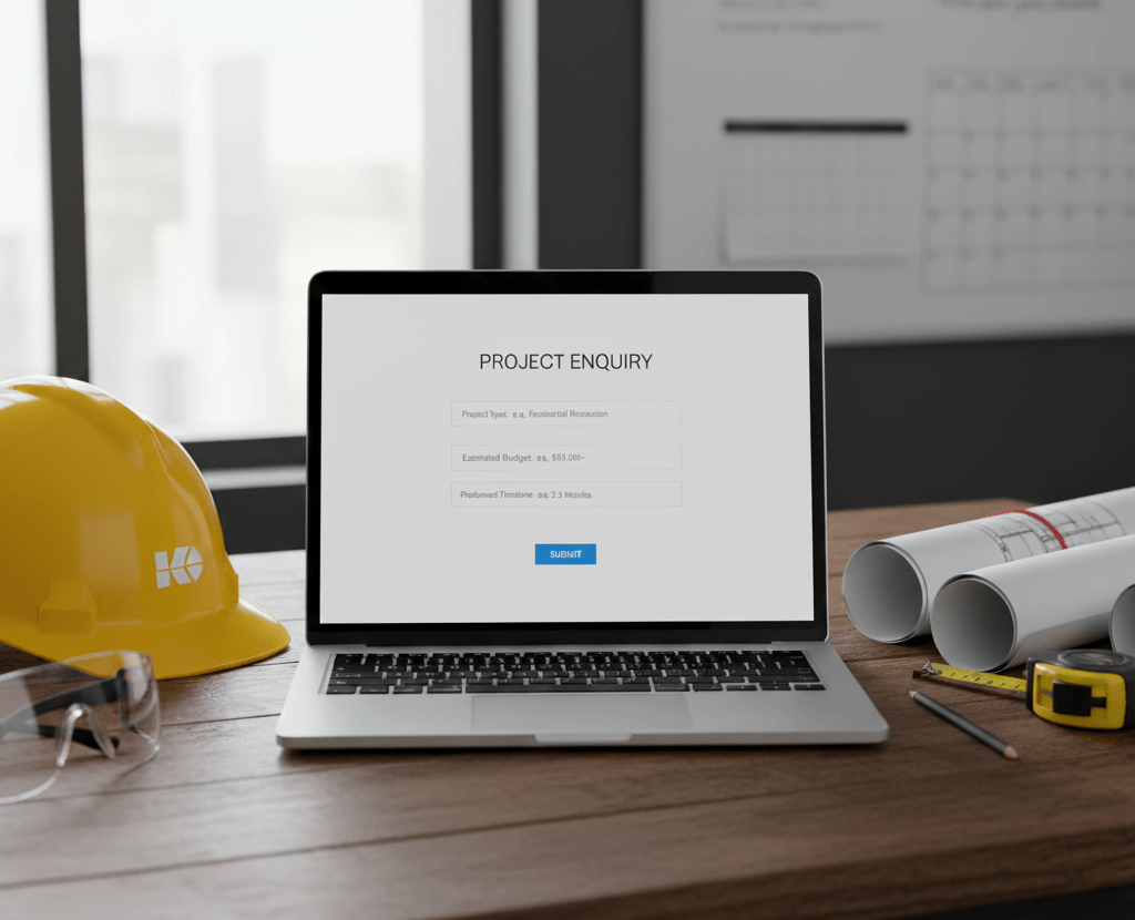
web design construction company


Portfolios that inspire as well as inform

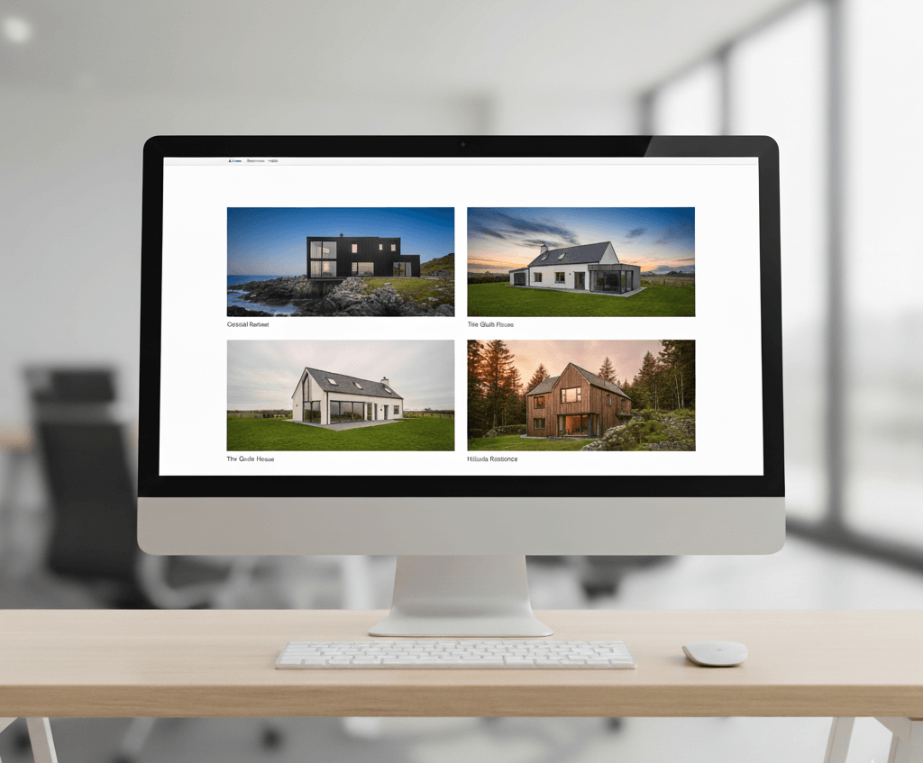
Homeowners often browse Pinterest or Houzz for inspiration before ever contacting a builder. When they land on a construction firm’s website, high-quality visuals can make all the difference.

Well-staged photography of completed projects — from new builds to extensions and heritage work — places your work directly into the imagination of potential clients. A gallery or portfolio page acts as proof of quality and vision.

SEO that targets the right areas

Search engine optimisation isn’t about attracting clicks from everywhere — it’s about attracting the right clicks. For construction firms, this often means focusing on specific areas.

For instance, a company specialising in Georgian house renovations will see better results targeting affluent neighbourhoods with many Georgian homes, rather than chasing generic traffic. Tailoring content and landing pages to these geographies improves visibility with the audiences most likely to enquire.

irish construction website designer


Professional memberships as reassurance

Logos and badges from industry bodies such as Engineers Ireland, the Construction Industry Federation (CIF), or ISO certification offer subconscious validation. They reassure visitors that a firm operates to recognised standards.

Placing these logos clearly on a homepage or enquiry page helps establish trust without needing lengthy explanations.


Other trust builders that work

  • Case studies with detail: short write-ups of challenges solved and results delivered.

  • Service clarity: distinguish clearly between residential, commercial, and specialist work.

  • Fast, mobile-friendly design: crucial for homeowners browsing on their phones.

  • Regular updates: project news, community work, or awards keep the site fresh.

  • Visible team profiles: professional photos of directors or managers humanise the company.


Building trust online

Choosing a contractor isn’t a small decision. It requires confidence, reassurance, and proof that a company can deliver. A strong website can support this decision-making process: filtering enquiries, showcasing work, and signalling credibility.

For Irish construction firms, the opportunity is clear. Those who invest in thoughtful, professional websites are far more likely to win the right kind of projects — and the right kind of clients.

ireland web designer construction company website

web designer ireland cafe clients

Why Word of Mouth Isn’t Enough Anymore (and How a Website Helps)

Why Word of Mouth Isn’t Enough Anymore (and How a Website Helps) 1024 843 Paul Cunningham

For generations, word of mouth has been the most trusted way of finding a reliable business. A neighbour recommending a builder, a friend suggesting a restaurant — personal referrals shaped choices long before the internet. Today, those conversations still happen. The difference is that they rarely end there. Almost everyone follows up by searching online, checking reviews, and comparing options.

Whether you run a café in Cork, a consultancy in London, or an agency in Singapore, word of mouth on its own no longer carries enough weight. A website has become the essential partner to any good reputation.


The Limits of Word of Mouth in 2025

Referrals remain powerful, but they face clear limits:

  • Reach is restricted. A personal recommendation only spreads as far as someone’s network. Scaling beyond that requires visibility online.

  • Verification is expected. When a name is mentioned, most people instinctively look it up. No website, or a poor one, creates instant doubt.

  • Information matters. Today’s customers want proof: examples of work, pricing, and reassurance that a business is credible. Word of mouth alone can’t provide that.

  • Trust now includes digital trust. Online reviews, testimonials, and social proof carry almost as much weight as personal referrals.

web designer ireland cafe clients


What the Numbers Say

Research suggests personal recommendations are still valued — but are now deeply intertwined with online discovery:

  • 88% of consumers trust recommendations from friends and family, but 70–90% also trust online reviews almost as much.

  • Around 13% of global sales are directly influenced by word of mouth, yet most of those buyers still validate the choice online first.

  • In B2B decisions, 91% of buyers say recommendations matter — but 84% research the supplier’s website before making contact.

The evidence points to a shift: referrals spark interest, but the website often decides whether that interest becomes action.


How a Website Strengthens Reputation

Think of word of mouth as the opening line of a conversation, and your website as the supporting evidence. Done well, it provides:

  • Legitimacy. Testimonials, case studies and up-to-date contact details make a business look credible.

  • Discoverability. People search for “web designer Dublin” or “best accountant near me.” Without a website, you’re invisible.

  • Control of narrative. Instead of relying on scraps of information, you can present your services, values and track record clearly.

  • Reach beyond borders. An Irish business can impress clients in New York or Sydney through its website in a way that word of mouth alone never could.

  • A hub for all other marketing. Social media, advertising and email campaigns almost always direct people back to the website.

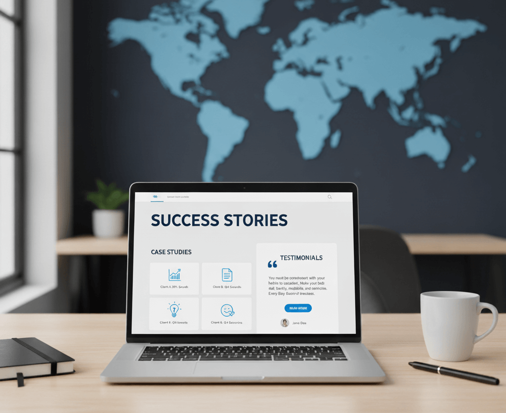
  • The image above was generated using AI (could you tell?). In a world of endless artifically generated information, and (as of writing) 50% of social media profiles operated by bots, your website remains the best way a customer can get a sense of what your business is about – and ultimately if you should win their business above the competition.

Blending the Old with the New

The strongest strategy isn’t to abandon word of mouth, but to pair it with a website that amplifies it. A happy client can still recommend you — but now they can also share a link. That link leads to your portfolio, your success stories, and proof that you are every bit as good as they say.

Word of mouth lights the spark. A strong website turns that spark into something lasting.

8 ways your web design can improve your conversions

8 ways your web design can improve your conversions 1280 853 Paul Cunningham

When it comes to your website, it’s all about conversions. Whether you’re looking for people to sign up for a trial, purchase a product, sign up for a newsletter, download an e-book, or book a consultation, making a conversion is that all-important goal for any business.

But it’s not just the quality of the e-book or the great deal on the product that drives those conversions. One of the biggest factors in website conversions is the design of the website itself, and there are many ways to improve that design in order to increase your conversions.

Here are our eight top tips for driving conversions through savvy website design.


1. Create a clear value proposition

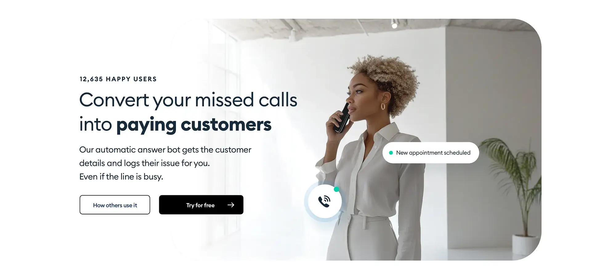
Your value proposition is your statement of just how valuable it is for the customer or client to buy from you. It’s your way of telling them exactly why they should make that purchase or sign up for a trial, and what’s in it for them. Your value proposition is what’s sets you apart from the crowd.

You have to be clear about not just what they’ll receive, but how it will benefit them. For example, we don’t just offer web design – we offer web design that works perfectly, looks beautiful and helps you connect with your audience.

This proposition should be at the centre of your website design, and it should be placed in the spotlight. This usually means at the very top of your homepage, which is the first thing your visitors see when arriving at your site. When they find exactly what they need right away, clearly and loudly, you’ll have a warm lead excited to keep reading.


2. Use consistent branding and layouts

In all things branding, consistency is key.

From the structure of each page across a website, to the fonts, colours, and image style, the look, feel, and function of a website must be consistent. This even includes basic elements such as the design of your call to action buttons, and the language you use from one page to another.

Inconsistencies in these areas can cause confusion for your reader, and someone who is confused about exactly what it is they’re purchasing or signing up for is going to be less likely to actually convert.

For example, if you’re trying to encourage people to sign up for a ‘free trial’, but your call to action for the trial is ‘Sign up for your free consultation’, readers might not be sure if that’s what they actually want.

Similarly, if a customer is used to making a purchase on your website with a green ‘check out now’ button at the top right of the product page, then suddenly encounter a red ‘buy now’ button on the bottom left, they might not see the different layout or get confused enough by the change to give up on the purchase.


3. Limit the number of options

Have you ever been in a restaurant and struggled to make a decision on which meal you want because at least half a dozen things look incredible? And even though you’d probably love all of them, found it really hard to make a decision?

By nature, humans are easily overwhelmed when there are too many options, and it’s as true for a great menu as it is in website design.

For example, it’s easy to assume that having three ‘buy now’ buttons on a landing page will make it easier for a customer to hit one of them and make a purchase. However, it’s more likely that the multiple options will simply confuse them – you’re better off with just one.

You might have a similar issue with product packages. If there are just two or three options, customers can quickly narrow down the best choice for their needs. If there are half a dozen, they might struggle to make a decision, tossing up between several and not wanting to make a final decision in case it’s the ‘wrong’ one.

Narrow down your options so your customers don’t have to.


4. Provide a clear call to action

Your call to action must be clear about what it does, and it must be in a logical place.

Aim to use as few words as possible to precisely explain what the button does. Here are a few examples of popular call to actions:

  • Buy now
  • Sign up to our newsletter
  • Book a consultation
  • Download e-book
  • Get started

When the call to action is clear, it gives the reader confidence about what they’re about to do. A call to action is not the place for clever wordplay or showing off your vocabulary – keep it simple so your audience quickly and easily recognises the next step.

Also, be sure to place the call to action in a space that makes sense. These buttons are almost never on the left hand side of the page, but are usually at the bottom, on the bottom right, or the top right. This is where your customer will expect to find it, so be sure to meet that expectation.

“By optimizing for customer success, you’re more than likely optimizing for growth.” ― Alex Turnbull

5. Simplify your navigation

A simple navigation is key to give your visitors a pleasant walk through your website. A well organised, yet simple menu will help your visitors find what they are looking for very quickly with the minimum amount of clicks.

Simplifying navigation also reduces the chance of them getting lost, struggling to find the right information, or giving up before they get to the right page. It should be simple enough for users to be able to find their way around your website easily.

It’s hard to judge how simple or complex your navigation is when you see your own site every day, so ask a trusted friend or family member who is unfamiliar with your site to go on and try to find a particular product or service. They might be able to point out snags that you can’t see for yourself.


6. Use meaningful images and graphics

Images and graphics should not be thrown in simply to fill a space, and every one of them should be chosen with care.

For example, images that are ‘corporate stock’ photos can make your brand seem less genuine because they are so obviously staged, so aim to only include ones that are meaningful and on-brand. Now, we’d love to clarify, that we are not totally against stock photos, they are a very good resource and can greatly enhance your brand message, but be very clear about the styling you need to properly match your brand: the elements that they show or represent, what colours they should have on them, etc. When designing your visual branding, your designer probably suggested a set of photos with a specific style on them, try to find similar ones.

If you can have professional brand photos taken then it’s even better! just make sure the photo you use on a specific page or section of your site really help visitors be convinced on taking that next steps on their journey.

If in doubt, it’s better to have no image at all than one that isn’t consistent with your branding. It’s fine to only have one or two images per page and leave plenty of white space to avoid crowding the space or pulling attention away from your call to action.


7. Build trust with social proof

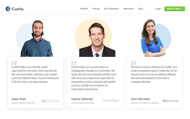
Social proof is simply when you show that other people enjoy and recommend your products and services, which helps to build trust and inspire new customers to convert.

One of the most common ways to do this is to include testimonials or reviews on your website. It doesn’t need to be an entire landing page or large section – it can be a small scrolling banner with short quotes or testimonials from happy customers.

There’s nothing quite like word of mouth when it comes to encouraging new sign ups, and ensuring you have social proof on your website is a good approximation of a recommendation.


8. Optimise for mobile and speed

Optimising your website for mobile use and speed have become two of the most important things you can do to boost your conversions, and not just for the reasons you might think.

Firstly, optimising your website for mobile simply means that it will be easy to use for those browsing your site from their smartphone. For example, this includes making sure the text is easy to read, that images load properly, and that they can fill out forms with their phone, among other things. This will ensure they don’t give up before converting simply because it’s too hard to navigate with a phone.

Secondly, optimising your website speed means that the pages will load immediately. The industry rule of thumb here is that every page should load in two seconds or less, and that the longer it takes after that, the higher the chance your user will give up and quit.

Finally, these website design factors are also both incredibly important for search engine optimisation (SEO). When you are optimised for both mobile and speed, Google is more likely to rank your website higher in search results, which means that you might have a better chance of being found in the first place, on top of the increased conversions from those on site.


The importance of great website design

There is no understating the importance or value of great website design, especially when it comes to maximising your conversions.